Pantone reveals its Colour of the Year 2022 – here it is an how to use it
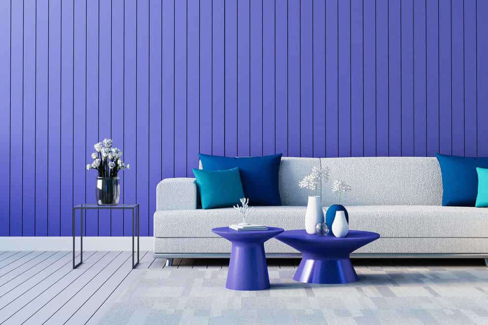
A larger than life shade to shop, the colour experts at Pantone Color Institute have named ‘Very Peri’ – a ‘dynamic periwinkle blue hue with a vivifying violet red undertone’ – as Colour of the Year 2022.
Said to be ‘blending the faithfulness and constancy of blue with the energy and excitement of red, this happiest and warmest of all the blue hues introduces an empowering mix of newness’, according to the Pantone pros, and it’s a shade that’s certain to bring your rooms to life.
Pantone cites Very Peri as being bold enough to‘encourage personal inventiveness and creativity’ – and yes it’s bold, but a little goes a long way.
“The Pantone Colour of the Year is a vibrant colour that incites the creativity in all of us. Uplifting and intriguing, this colour can be used in all interior spaces, either as a feature or highlight colour,” says Paula Taylor, stylist and trend specialist for Graham & Brown.
There are lots of ways you could mix and match or pair the shade with other hues, to create different levels of punch.
Teamed with crisp off-whites, Taylor says Very Peri can create a twist on the timeless look for a modern bedroom. Or it could be part of a moodier layered boudoir with a cosy luxurious feel, when teamed with greys and plum tones.
“For the braver decorators out there, you can get creative and use on accent pieces in the living room or dining room to highlight the doors, architraves, or any other architectural elements, showcasing an individual contemporary style,” suggests Taylor.
“You can also add decadence and luxury to your bathrooms by teaming with iridescent accents and rich metallics.”
A blue often found in nature – think periwinkle flowers and plants, climbing wisteria, catmint and lavender – as Sarah Ratty, creative director for Cielshop Interiors observes, this shade can create a relaxing mood to any room.
“From the indigo family, it’s an important colour as it allows the eye to rest, it has a natural element of calm,” says Ratty. “It’s a flexible colour that can be softened or contrasted with monochrome and deeper tones of blue.
“It’s an optimistic shade to start 2022,” she adds, noting that if you’re not sure where to begin, use periwinkle at home by layering tone on tone. “Play with shades of colour offset with neutral items in wood, crystal, and monochrome deep blues, iced lilac, lavender and silver to add a touch of cosmic sparkle.”
Looking at home tech within your carefully curated space, Ratty says screens and other devices can be softened by the use of this tone – whether it be in the form of simple shapes, rugs, cushions, glassware, lighting, artwork, or even books and textiles to capture your attention.
“Try layering crystals in an entertaining room – large amethysts, lapis lazuli – and match with accessories like agate slice coasters, bookends, blue glass and barware,” she adds.
Indeed, homeware designers are already putting a generous pinch of periwinkle into new designs for this year.
Given that Pantone says this new shade ‘lends itself to unpredictable colour harmonies and spontaneous colour statements’, it might be time to rethink your pared back neutral scheme. Adding some purple pizzazz is bound to breathe new life into soft furnishings or decos in winter white, ivory, beige or dove grey.
“Very Peri is a fantastic statement colour, and it’s great to see this move towards new beginnings and optimism start to creep into the world of fashion and interiors,” says Daniel Prendergast, managing director of The Rug Seller.
“We’ve seen a growing trend for people embracing more vibrant and uplifting colour palettes, with shades of pink, yellows and blues gaining in popularity, as people look to inject more colour into their homes – moving away from the greys and classic neutrals that have been so popular.”
As Prendergast puts it: “Styling Very Peri is all about being brave and using it as a statement colour to form the rest of your scheme around – especially when it comes to rugs. Many people will naturally opt for neutrals when choosing a rug but that doesn’t have to be the case.
“A Very Peri inspired coloured rug can really pop against a neutral backdrop (think grey carpet or hard wood flooring), making it the star of the show in any room.”
If a block of vivid purple or blue is too much for you, think about designs which incorporate it into the pattern. “For example, a geometric or an abstract design. This will offer depth and break up the palette,” says Prendergast.
Of course, there are other subtle ways you can bring this shade into your home. Prendergast says to look for accessories such as cushions and bedding, as well as candles, ornaments and smaller pieces that draw on different shades of purple and blue.
“Start to build these into your design scheme to bring in touches throughout the home,” he adds. “The key really is to have fun with it – it’s an uplifting colour that will bring you joy. Soon you will wonder what you ever did without it!”
The best videos delivered daily
Watch the stories that matter, right from your inbox